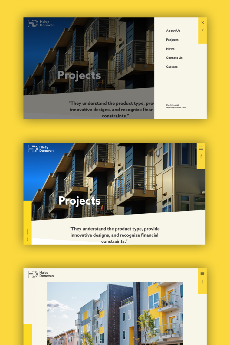
A new logo is the centerpiece of Haley Donovan’s new branding system. As with their previous logo, it represents the firm’s initials. We simplified, making it more quickly perceivable and recognizable--and easier to reproduce on collateral and swag, which the team quickly did. The interconnectivity of the letters represents the firm’s cohesive approach to their work, and the openness reflects the approachability that makes them stand out. The team at Haley Donovan told us that the logo also evoked for them a sideways shovel, a symbol key to the effort of getting a building built.
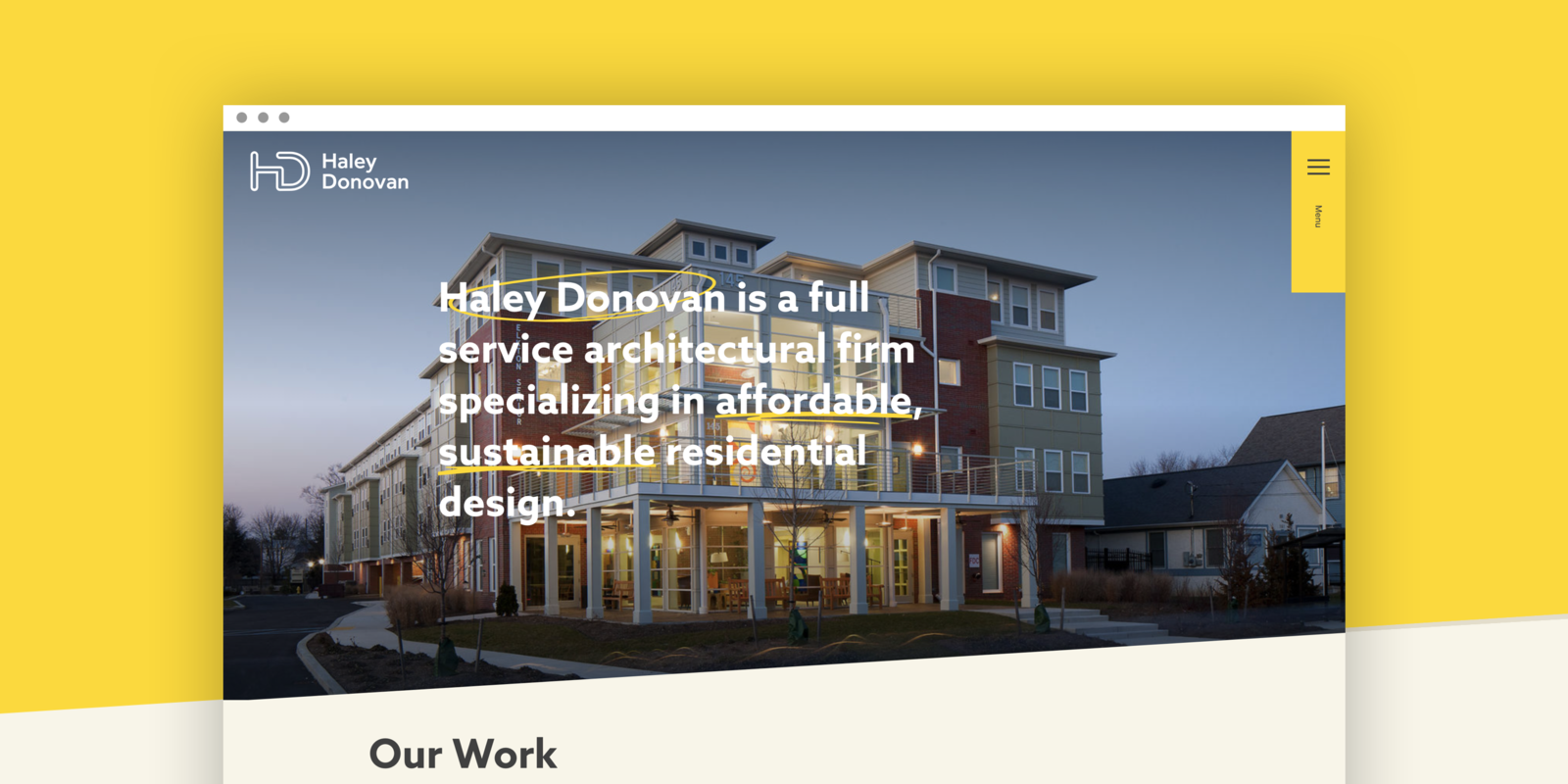
In approaching the design of a new logo and website, we wanted to ensure that Haley Donovan’s expertise and personality shone through. The clean, open, modern feeling they’d gravitated towards in the workshop was a good foundation, but didn’t adequately capture the team’s unique energy. To add another layer of personalization to the website, we turned to their work for inspiration and combined two elements that were uniquely “them.”
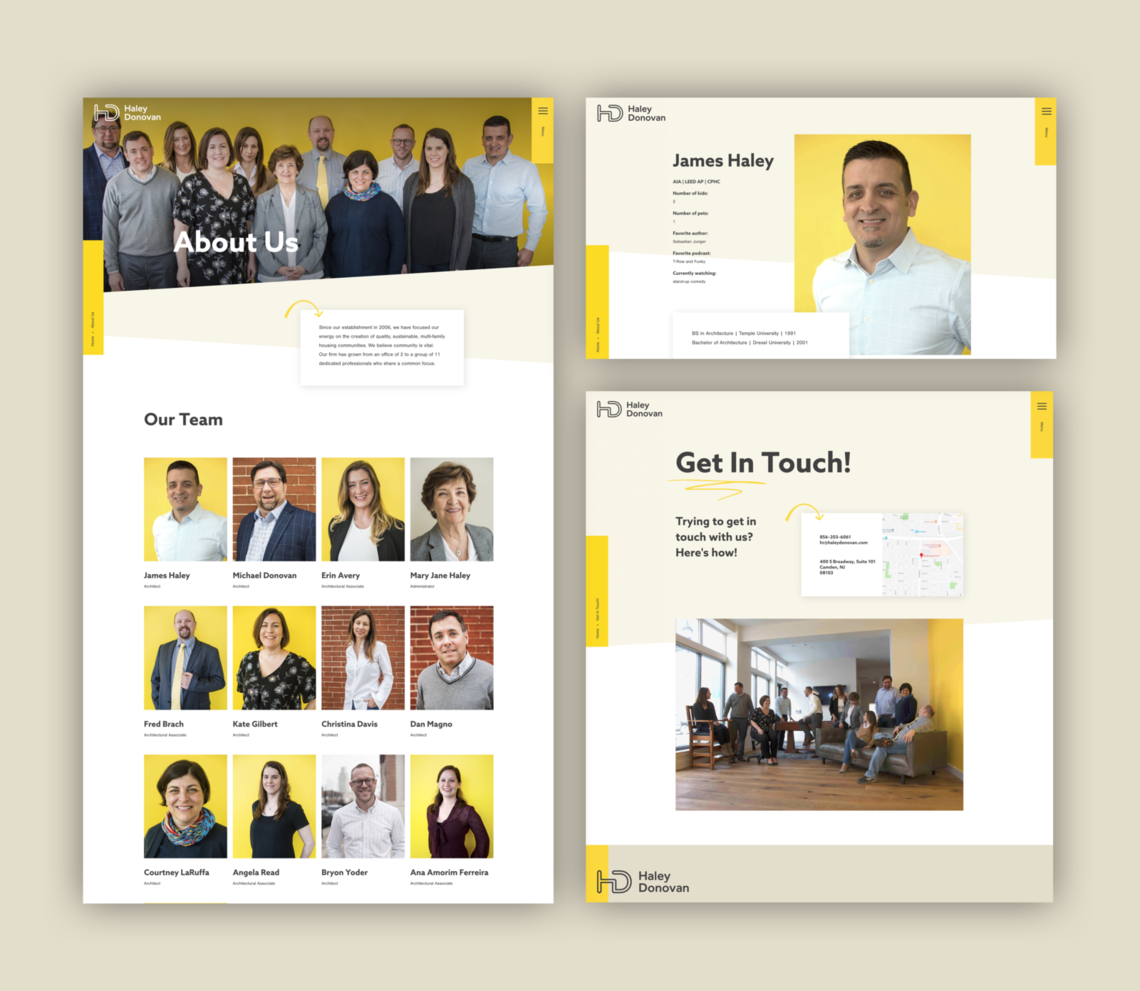
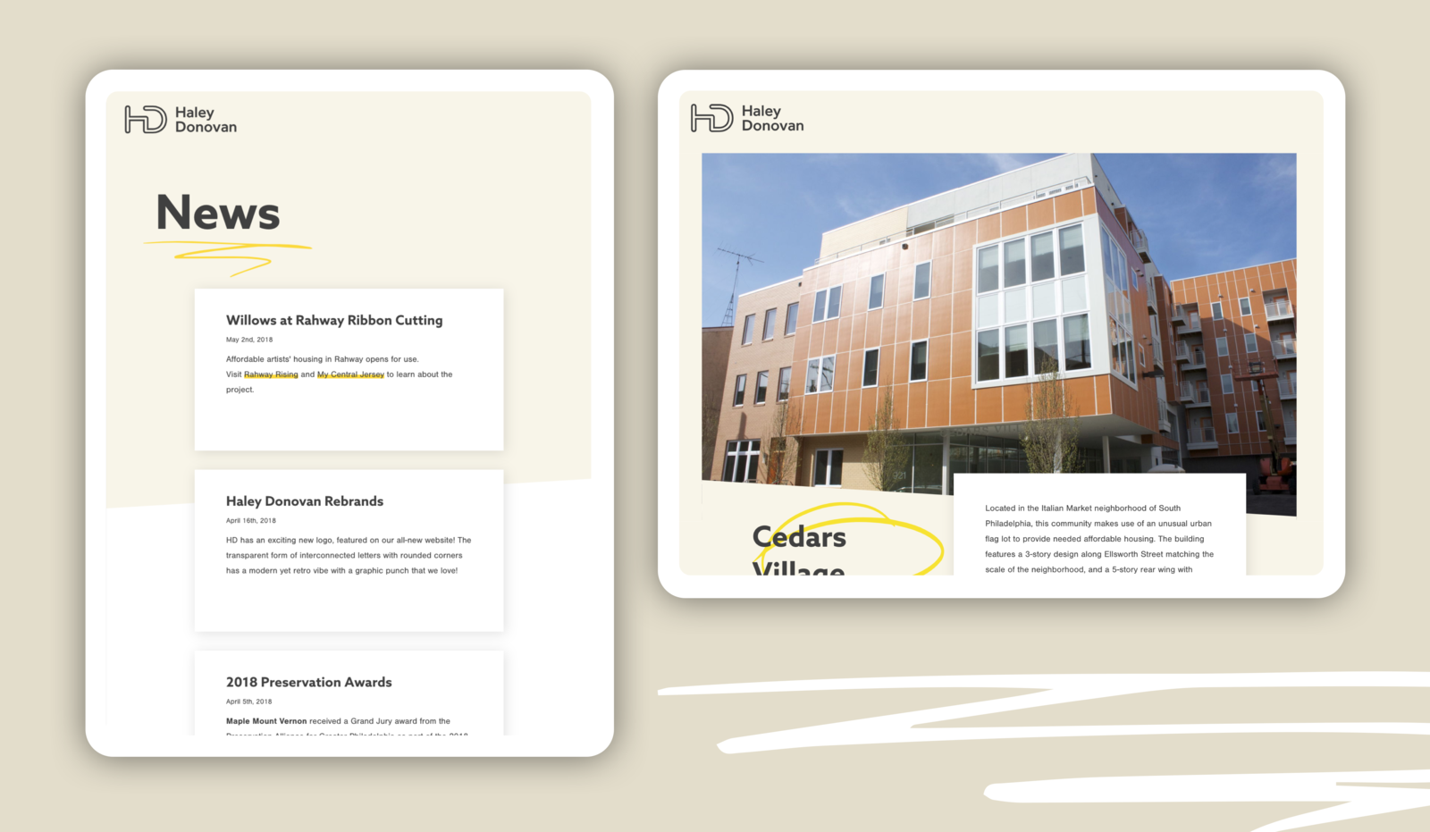
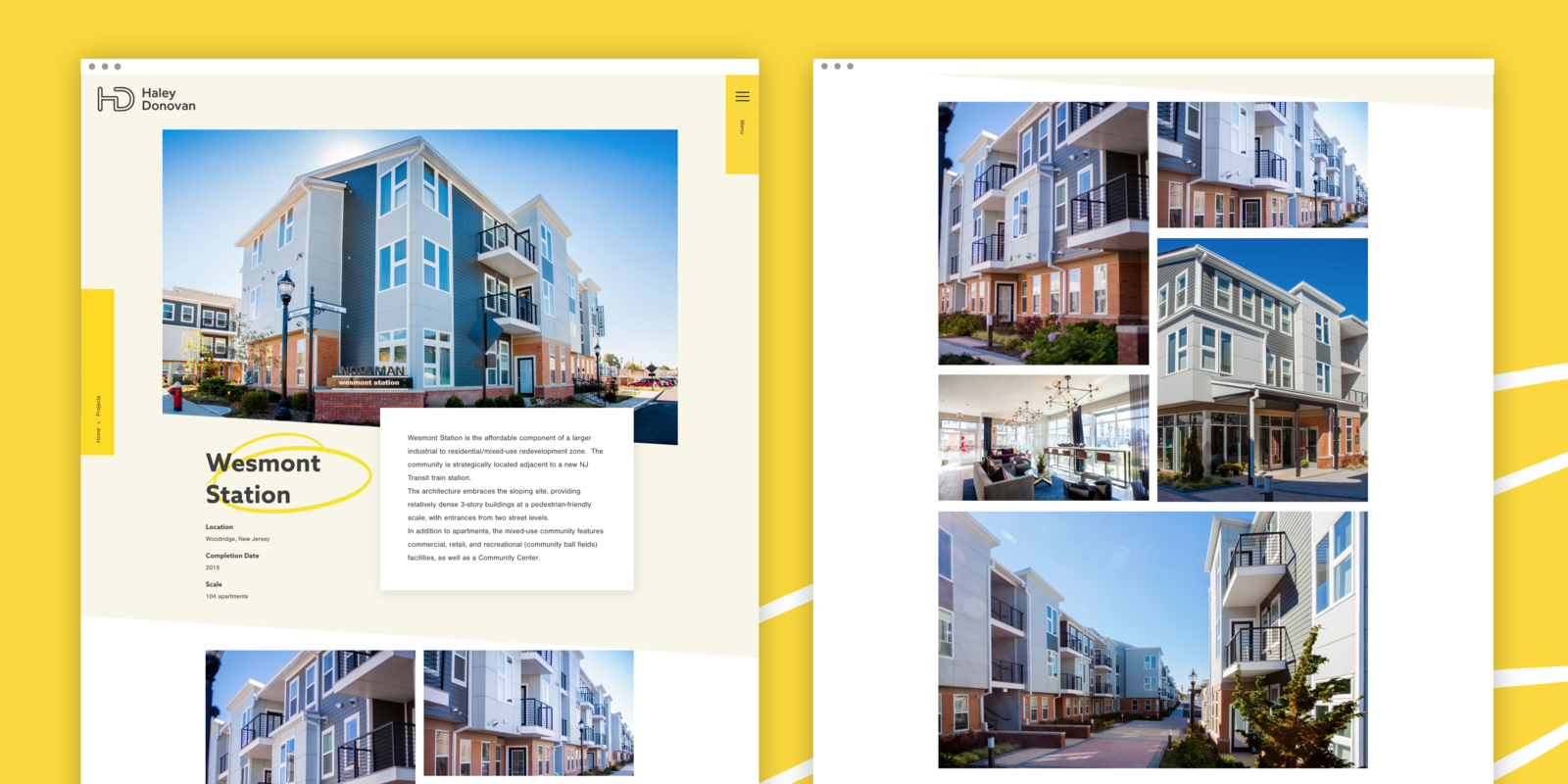
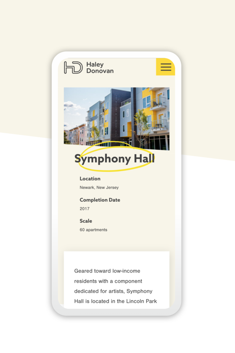
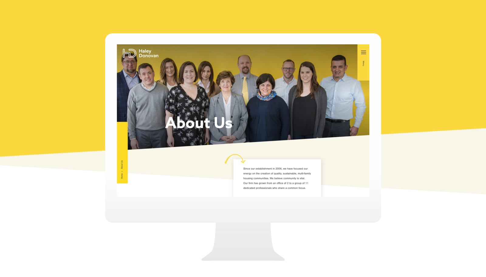
First, it was easy to identify a color that resonated with the team, as they were excited about a cheery canary yellow and they’d used it in a few recent designs. Second, we repurposed arrows hand-drawn by one of the firm’s principals on architectural plans as navigational elements throughout the site, supplementing them with circles, squiggles, and underlines to evoke the feeling of openness and collaboration throughout the site.