fnm common hour
Websites & Apps

Franklin & Marshall College

Franklin & Marshall engaged P’unk Avenue to redesign and rebuild their website. Through a year-long process of research, strategy, design, and development, we helped them create an emotionally engaging web presence designed chiefly for prospective students. 

fnm home

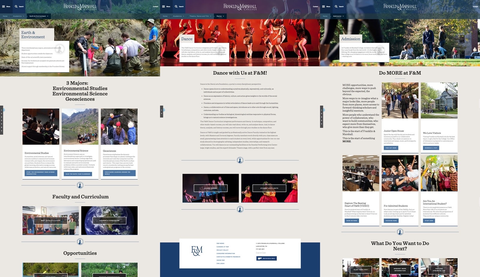
Designing for the Future

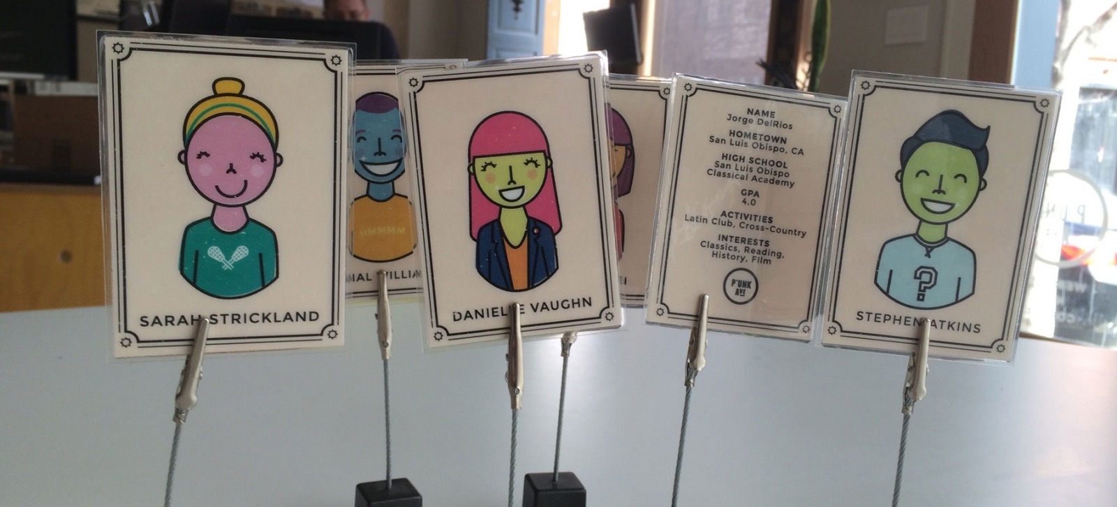
Franklin & Marshall College has a clear idea of the kinds of students who will succeed in its residential, liberal arts experience. The main challenge of redesigning the college’s website was making sure that the user experience and design language spoke clearly to that audience. Traditionally, the website had represented and foregrounded information from an institutional perspective rather than a prospective student’s. Throughout the project, our team, along with the stakeholders at Franklin & Marshall, returned to the question: “How will this work for a prospective student?” Keeping that question in front of us at all times was our metric of success from research to launch. We even went as far as creating a physical reminder of the prospective students in the form of a playing card. At our kick-off meeting, we gave each stakeholder a “prospective student” to take back to their office as a reminder of our common goal.


fnm student cards

Uncovering the Experience

Somewhere between the campus tour and trudging through a foot of fresh snow to our workshop, our research team began to uncover a kind of authentic experience that students at F&M all seemed to have. It was partially about the unique first-year houses. It was partially about the Common Hour on campus each week. It was partially about a culture of research collaboration between students and faculty. All of these added up to a rich experience that made the difference for students choosing Franklin & Marshall. We knew that conveying this experience through the website was crucial as recruiting and admissions were growing both globally and digitally. One branch of this strategy called for using photography which gave the viewer a sense of participation in a particular scene, making the user feel as if they were a part of the experience that the site was conveying.


fnm campus life

Designing for Identity and Unity

One of the difficulties of designing for any academic institution is representing the unique identities of each of the departments and offices while still giving users a consistent experience across the whole website. In addition, we knew that any page on the website could serve as a potential point of entry for prospective students and other external audiences. To solve this design challenge, our team of designers came up with a flexible system of pages that allowed departments and offices to create a unique identity through consistent content across their pages. We knew that F&M had a wealth of student-oriented photography, so the designers created ways for groups across campus to use that photography in their unique spaces. We also knew that we’d have to rely on our partners to help keep that sense of consistency (but more on that in a bit).

fnm templates

Building a Flexible Template System

When it came to building these flexible templates for the content editors and producers at F&M (their term is Web Content Implementors), our development team knew that versatility was paramount. To offer editors the ability to create unique layouts with a variety of content types, we built two basic templates that offered a variety of “blocks” with combinations of column structures. This allowed the group of 120+ editors to build close to 2,000 pages with just the two templates. 

fnm editing

Empowering our Partners

Knowing that we had a large pool of content implementors, we knew that partnering with the communications and technology teams at F&M would be crucial for disseminating strategy and training users on our CMS, Apostrophe. To do that, we ran some initial strategy and training sessions with their teams and eventually attended and supported sessions where they became the facilitators and trainers. Empowering them to own the strategy and technology was crucial to ensuring a consistent content and design strategy across such a wide pool of CMS users.

sri for f m case study

Apostrophe in Production

From a technical perspective, our development team was excited to put our CMS, Apostrophe, to the test in a heavily trafficked environment like a college website. Since Apostrophe is built on Node.js, we knew that we’d have to account for the application to run across multiple server cores. This project gave us the opportunity to build a multi-core extension to Apostrophe which gave us the additional advantage of safe “fall-over” situations in which errors in the system are handled gracefully with little to no interference for users.


Similar Projects
Websites & Apps
Daytona State College
Giving Everyone a Reason To Get a Degree
Websites & Apps
Wissahickon Trails
PUNK Letters
Have a project in mind?
Reach out to us to start a conversation!
hello@punkave.com 215.755.1330
Rachel Emery
Director of Partnerships